
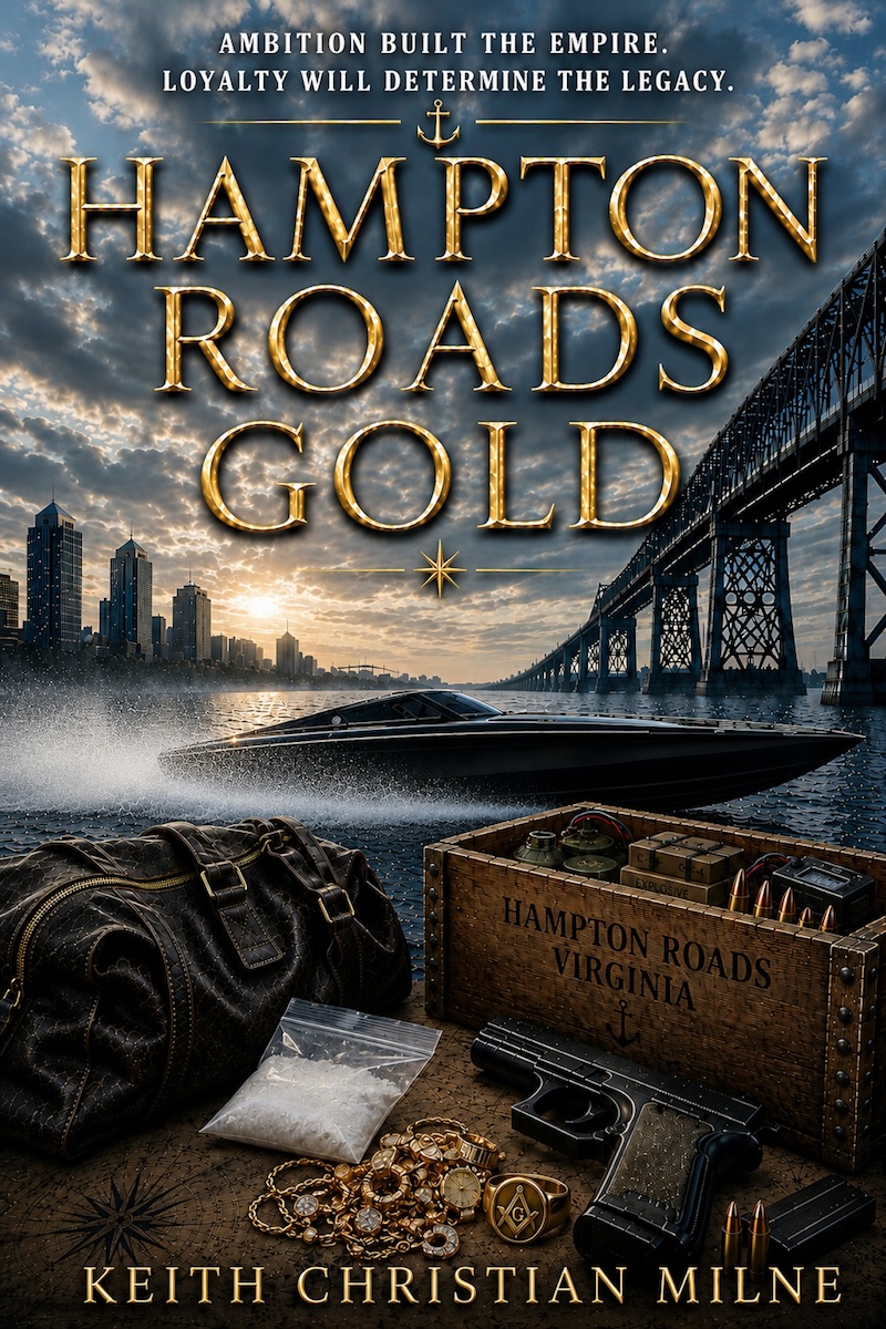
I wasn’t liking all the inferno-orange on the old one. The new pic contains more relevant information about what the book has in store for a reader. What do you think? Like it better, or the mostly orange/gold version? Let me know by leaving a comment.
Thank you.
Leave a Reply